A single convincing render is not a project presentation. The harder test is whether the next angle still looks like the same room.
Material consistency means that repeated surfaces retain a recognisable design identity as the camera changes: the same warm timber remains warm timber, the same stone remains in the same family, and a green sofa does not quietly become beige. It does not mean that every pixel, reflection or grain pattern will be identical. AI outputs are generative, so each view still needs comparison and review.
The most reliable workflow is to define the material system once, carry a small set of visual anchors through every view, and correct local drift before it spreads across the set.
1. Start with a material contract
Before rendering the first angle, write a short project-level specification for the surfaces that must repeat. Treat it as a material contract shared by every view.
For each important material, record:
- surface and location — where the material belongs;
- material family — oak, limestone, plaster, brushed steel;
- colour and undertone — pale warm oak, not simply “wood”;
- finish — matte, honed, polished, brushed or rough;
- pattern and scale — wide plank, small-format tile, fine grain;
- direction — vertical grain, straight lay, book-matched;
- scope boundary — which surfaces must not inherit the material.
For example:
Kitchen base units and full-height joinery: warm natural oak veneer, matte finish, fine straight grain, vertical on doors. Do not apply to the floor, ceiling or white upper cabinets.
That final boundary matters. “Use oak throughout” may communicate a mood, but it does not tell a renderer which surfaces are fixed and which are allowed to change.
2. Separate exact specification from visual intent
Decide what level of accuracy the presentation actually requires.
| Requirement | Useful instruction | What to verify |
|---|---|---|
| Material family | “warm pale limestone” | It still reads as limestone, not concrete or marble |
| Visual character | “subtle movement, honed, low contrast” | Pattern, sheen and contrast remain restrained |
| Layout | “600 × 600 mm straight-laid tiles” | Joint scale and direction remain plausible |
| Named product | Product name plus a supplied reference | The output resembles the approved sample |
| Construction decision | Drawing, schedule or sample board | Never approve it from the render alone |
A named product can help communicate intent, especially when paired with a reference image. It is not a guarantee of exact colour, dimensions or manufacturer pattern. If a product match matters commercially, compare the render with the current physical or manufacturer-approved sample.
3. Prepare every SketchUp Scene from the same model state
Save each camera as a SketchUp Scene. Keep visible tags, major furniture, material colours and design options aligned between scenes.
Before exporting a new angle, check that:
- the same design option is active;
- fixed joinery and furniture have not moved;
- floor, wall and ceiling use distinct source colours;
- repeated materials use the same simple source colour;
- the camera is final before rendering;
- the export has the intended aspect ratio.
The renderer receives a flattened viewport, not the full SketchUp model. Clear source colours help it see where one material assignment ends and another begins.
If you need a fuller source-model check, use the SketchUp pre-flight checklist.
4. Give each reference one job
References are most useful when their role is unambiguous.
- A material reference defines colour, texture and finish.
- A lighting reference defines light quality and contrast.
- An object reference defines a particular piece of furniture or fitting.
- A context reference defines what appears outside or around the model.
- A completed project view can guide the overall visual language of a later angle.
Do not use a beautiful room photograph as an unrestricted reference when you only want its stone. The renderer may also pick up its furniture, lighting or spatial language.
When several references are required, state what should be taken from each one and what should remain controlled by the SketchUp source.
5. Establish one anchor view
Render the widest, clearest angle first. It should show most of the project’s dominant surfaces and repeated objects.
Do not move on as soon as the image looks attractive. First confirm:
- the architectural envelope;
- fixed joinery;
- the dominant floor and wall finishes;
- feature furniture;
- the lighting direction and colour balance.
Once accepted, this becomes the anchor view for the rest of the set. Keep its material contract beside every later angle, and use the accepted image as an overall-look reference only where the workflow supports a clearly defined reference role.
For a specific new angle, follow the Next View guide using a new model image and your approved render.
6. Preserve a small set of visual anchors
Most viewers do not compare every texture sample. They recognise a project through repeated high-salience elements.
Good anchors include:
- a dominant timber tone;
- a distinctive stone or tiled surface;
- a feature upholstery colour;
- a repeated pendant or table;
- fixed shelving or kitchen joinery;
- a stable daylight character.
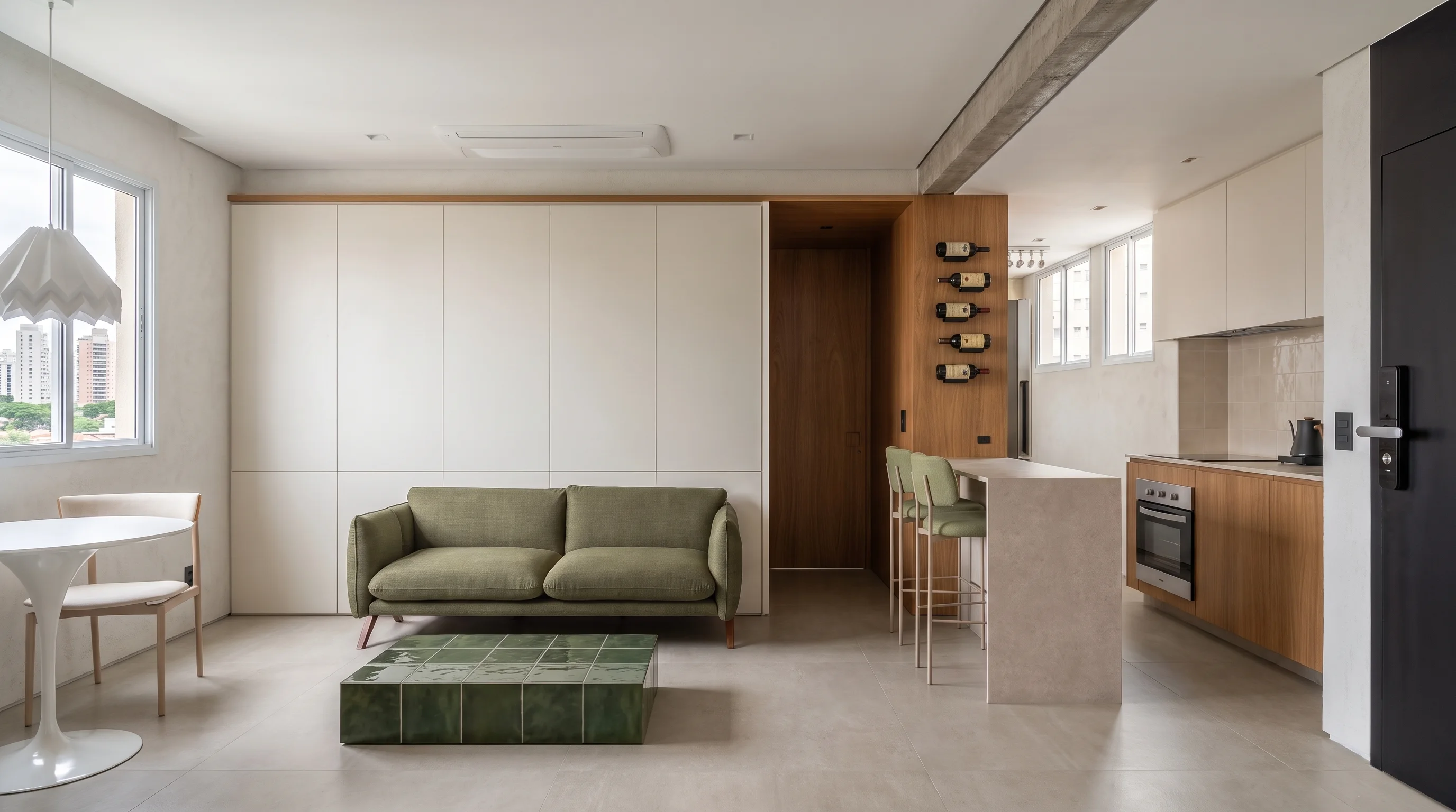
In Apartment LNC, the living and kitchen views are held together by warm timber, pale surfaces and muted green accents. The value is the repeated material language—not a claim that every texture is an exact digital duplicate.
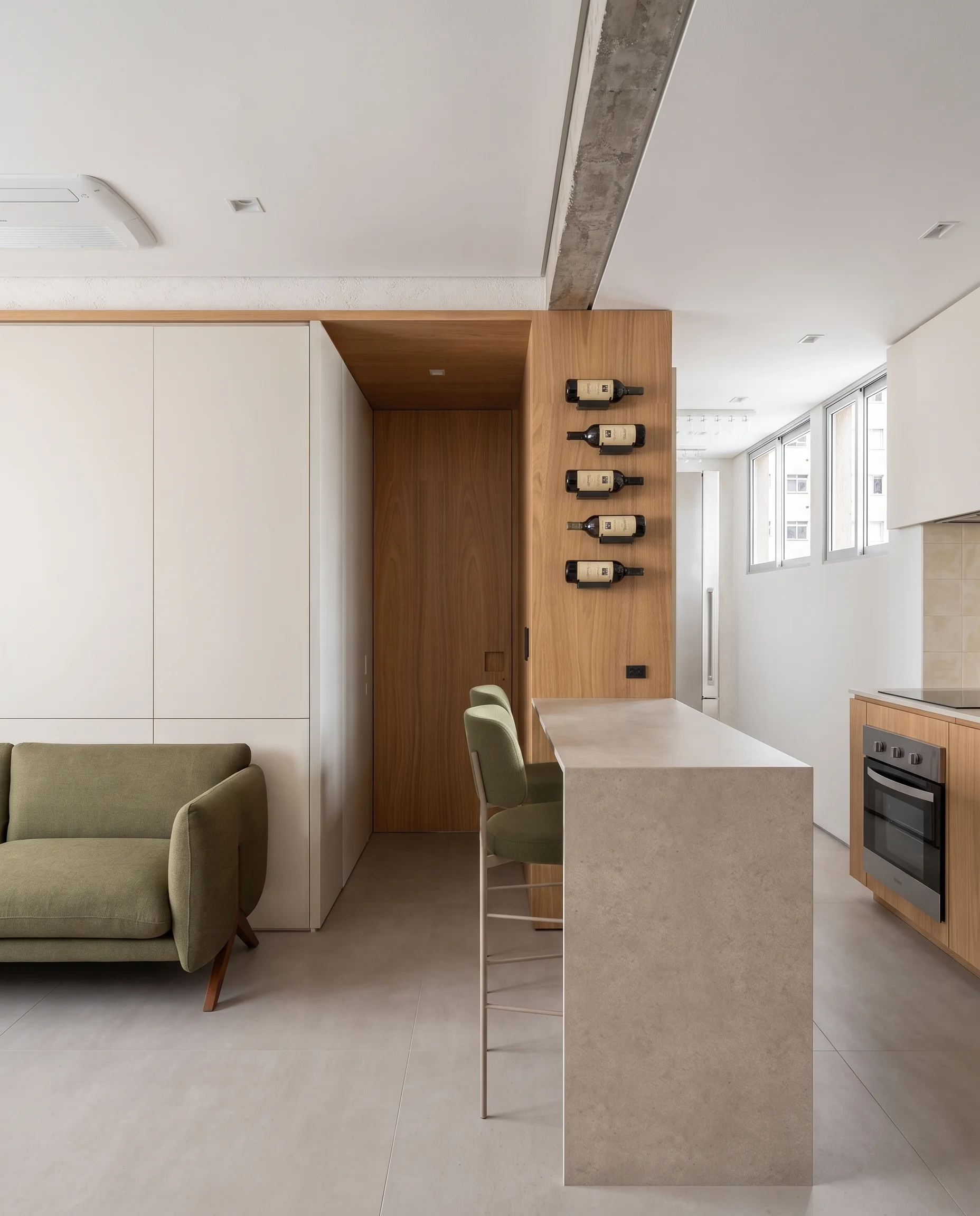
The closer kitchen angle tests the same system at a different scale. This is where changes in stone tone, timber warmth, pattern size or gloss become easier to spot.
7. Review in the right order
Compare each new render with both its own SketchUp source and the accepted anchor view.
Review in this order:
- Camera and geometry — is it still the intended view?
- Surface assignment — is timber, stone or tile on the correct surface?
- Dominant colour family — has warm oak become grey or orange?
- Pattern scale and direction — are boards, tiles and veins plausible?
- Finish and reflection — has honed stone become mirror-polished?
- Small objects and styling — only after the project fundamentals pass.
This order prevents a common mistake: perfecting the grain on a cabinet that has changed size or moved.
8. Correct one class of drift at a time
When a view diverges, identify the smallest clear correction.
Useful corrections are specific:
- “Keep the kitchen joinery warm natural oak; the current result is too orange.”
- “Retain the same pale honed stone from the accepted wide view on the island only.”
- “Keep the green upholstery; do not transfer green to walls or cabinetry.”
- “Preserve the SketchUp tile boundaries and reduce the visible pattern scale.”
Avoid rewriting the entire material brief after every result. Changing several variables at once makes it difficult to know which instruction improved—or damaged—the next image.
If the source boundary itself is unclear, return to SketchUp and separate the surfaces there. Repeated regeneration is unlikely to solve a source that still reads ambiguously.
9. Use a simple continuity sheet
For a multi-room presentation, keep a small review table:
| Material anchor | Approved view | Later views checked | Status |
|---|---|---|---|
| Warm oak joinery | Living wide | Kitchen wide, island, front | Accept / revise |
| Pale honed stone | Kitchen wide | Island, front | Accept / revise |
| Muted green upholstery | Living wide | Window, shelving | Accept / revise |
| Soft neutral daylight | Living wide | All interiors | Accept / revise |
Record only decisions that matter. The sheet is not a substitute for drawings or a material schedule; it is a fast way to stop one angle drifting unnoticed.
Common causes of inconsistent materials
The prompt changes between angles
Small wording changes can introduce a new palette. Reuse the project-level material contract and change only view-specific instructions.
A reference has more influence than intended
A material reference also contains lighting, furniture and architecture. Define its role and scope rather than asking the next view to “match this image.”
The source uses one colour for several surfaces
If floor, wall and cabinetry are all grey in the viewport, the renderer has weak evidence about their boundaries. Separate them before export.
Lighting changes the perceived material
The same stone can look warmer at sunset and cooler under overcast light. Decide whether the set needs one stable presentation light or intentionally different lighting conditions. Do not diagnose every colour shift as a material-assignment failure.
The close view exposes more detail
A wide image can hide incorrect joint scale, gloss or grain direction. Review close views against the written contract, not only against the appearance of the wide render.
A final pre-presentation check
Before sending a set to a client, ask:
- Do all views come from the intended model state?
- Are the camera and fixed architectural elements preserved?
- Do repeated surfaces keep the same material family and placement?
- Are colour temperature and lighting changes intentional?
- Do tile, plank and vein scales remain plausible?
- Have any reference-only objects appeared?
- Are named products labelled as indicative where exact matching is unverified?
- Has every image been checked against the SketchUp source?
Consistent AI renders come from consistent decisions. Define the material system once, preserve its visual anchors, and compare every new angle before it joins the project set.
Related: See the seven-view Apartment LNC case study, read why material specificity matters, or review geometry preservation in AI rendering.